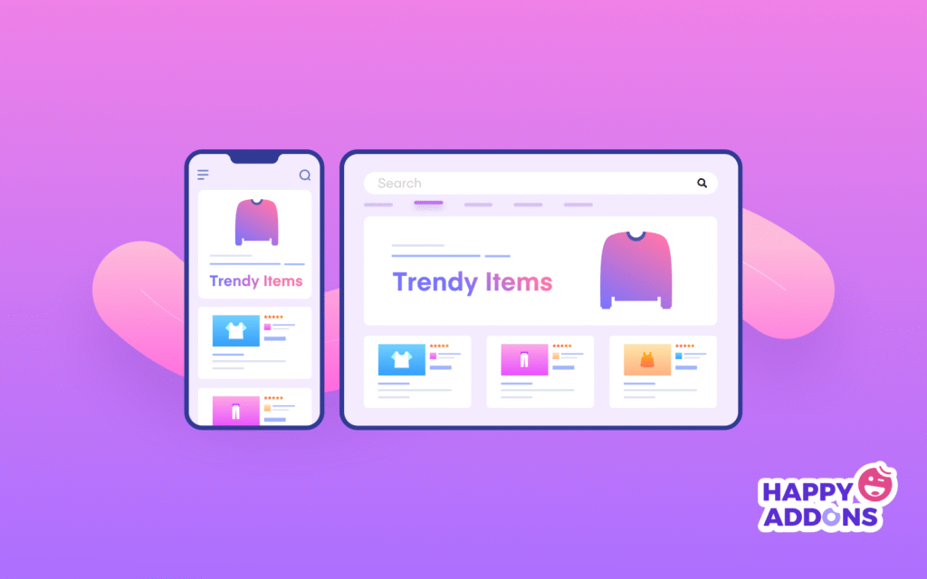
In today’s world, most people use their phones and tablets more than desktop computers. If your website does not work well on smaller screens, visitors may leave quickly. A mobile-friendly website makes sure that users can read, scroll, and interact with your site easily on all devices. This guide will show you how to build and improve your website so it works smoothly for everyone, whether they visit from a phone, tablet, or desktop.
Why Mobile-Friendly Websites Matter
People expect a website to load fast and look good on their device. If it doesn’t, they move on. A mobile-friendly website helps you keep visitors longer and turn them into customers. Search engines like Google also give better ranking to websites that are easy to use on phones. This means if your site is not mobile-friendly, you may lose both visitors and search visibility.
Key reasons why it matters:
- Most traffic comes from mobile users.
- Google ranks mobile-friendly websites higher.
- Better user experience keeps people on your site.
- Mobile users expect fast loading and easy navigation.
What is a Mobile-Friendly Website?
A mobile-friendly website is one that looks and works properly on any device. The design adjusts automatically to the screen size. Text should be readable without zooming, and buttons should be easy to click.
Main features of mobile-friendly websites:
- Responsive design that adapts to screen sizes.
- Clear and simple navigation menus.
- Images that fit correctly without cutting off.
- Fast loading time on mobile internet.
How to Test if Your Website is Mobile-Friendly
Before improving your site, check if it already works well on mobile.
Ways to test your website:
- Open your site on your phone and see if it is easy to use.
- Use Google’s Mobile-Friendly Test tool.
- Resize your browser window on a desktop and watch how the site changes.
- Check if fonts, buttons, and images adjust correctly.
If the site looks broken, loads slowly, or requires too much zooming, it needs improvement.
Checklist for a Mobile-Friendly Website
Here is a simple checklist to follow when building or improving your site:
- Use a responsive website design.
- Keep text size large enough to read on small screens.
- Make menus easy to click and simple.
- Avoid pop-ups that block the screen.
- Compress images to load faster.
- Use clear and short headings.
- Place buttons where they can be tapped easily.
- Test regularly on different devices.
Steps to Make Your Website Mobile-Friendly
1. Choose a Responsive Design
A responsive design makes your site flexible for all screen sizes. Modern website builders like WordPress, Wix, or Shopify already offer themes that adjust automatically.
2. Improve Page Speed
Mobile users may leave if a page takes more than 3 seconds to load. Use compressed images, fewer heavy scripts, and a good hosting service to keep the site fast.
3. Simplify Navigation
Mobile screens are small. Use a simple menu with fewer options. A “hamburger” menu (three-line icon) works well for mobile websites.
4. Use Readable Fonts
Keep your text at least 14px for body content and larger for headings. Small fonts make users zoom in, which is frustrating.
5. Optimize Images and Videos
Use images that scale properly on all devices. Videos should also play without needing extra apps or downloads.
6. Avoid Pop-Ups
Pop-ups are hard to close on small screens. Instead, use simple banners or short messages that do not block content.
7. Test Regularly
After updates, always test your site on different devices like iPhone, Android, and tablets to make sure everything works fine.
Best Practices for a Mobile-Friendly Website
- Keep layouts clean and simple.
- Use large, finger-friendly buttons.
- Place important content at the top.
- Limit text blocks to short paragraphs.
- Avoid flash or outdated plugins.
- Add spacing between links and buttons to prevent mistakes.
SEO Benefits of Mobile-Friendly Websites
A mobile-friendly site not only helps users but also supports your SEO strategy. Google uses mobile-first indexing, meaning it looks at the mobile version of your site for ranking.
SEO benefits include:
- Higher ranking in search results.
- Lower bounce rate as users stay longer.
- Better local search performance.
- Increased chances of converting visitors into customers.
Pro Vs. Cons of Mobile-Friendly Websites
Pros
- Easy to use on any device.
- Better ranking on search engines.
- Increases visitor time on site.
- Makes navigation simple for users.
- Improves customer trust.
Cons
- May require redesign if your current site is old.
- Needs continuous testing on new devices.
- Some advanced features may not work well on all phones.
- Extra effort to compress images and speed up loading.
Common Mistakes to Avoid
- Using small text that requires zooming.
- Buttons placed too close together.
- Forgetting to check site speed on mobile.
- Pop-ups that block content.
- Not testing on different screen sizes.
Tools to Help Build Mobile-Friendly Websites
Here are some tools you can use to check and improve your site:
- Google Mobile-Friendly Test
- PageSpeed Insights
- GTMetrix
- Pingdom Website Speed Test
- BrowserStack for testing across devices
Future of Mobile-Friendly Websites
The trend of mobile browsing is only going to increase. People prefer using phones for shopping, reading, and searching online. Having a mobile-friendly website is not optional anymore. Businesses that focus on mobile usability will keep more visitors and get better search visibility.
Final Checklist Before Launch
Before making your website live, check the following again:
- Is the design responsive on all screens?
- Does the website load under 3 seconds?
- Are fonts and buttons easy to use on small devices?
- Is navigation simple and clear?
- Did you test on multiple devices and browsers?
If your answers are yes, your site is ready for mobile users.
{
“@context”: “https://schema.org”,
“@type”: “Article”,
“mainEntityOfPage”: {
“@type”: “WebPage”,
“@id”: “https://pinaunaeditora.com.br/optimize-your-site-all-devices/”
},
“headline”: “Mobile-Friendly Website Guide: Optimize Your Site for All Devices (2025)”,
“description”: “This image illustrates a mobile-friendly and responsive website design, showing how an online store displaying “Trendy Items” appears on both a smartphone and a tablet screen. It emphasizes seamless user experience across devices, highlighting modern eCommerce layouts with product listings, ratings, and search functionality. The design is branded with Happy Addons.”,
“image”: “https://pinaunaeditora.com.br/wp-content/uploads/how-to-make-a-website-mobile-friendly-1-1024×640.png”,
“author”: {
“@type”: “Organization”,
“name”: “Pinaúna Editora”,
“url”: “https://pinaunaeditora.com.br”
},
“publisher”: {
“@type”: “Organization”,
“name”: “Pinaúna Editora”,
“logo”: {
“@type”: “ImageObject”,
“url”: “https://pinaunaeditora.com.br/wp-content/uploads/2022/10/logos-pinauna/logo_pinauna.svg”
}
},
“datePublished”: “2025-08-25”,
“dateModified”: “2025-08-25”
}


